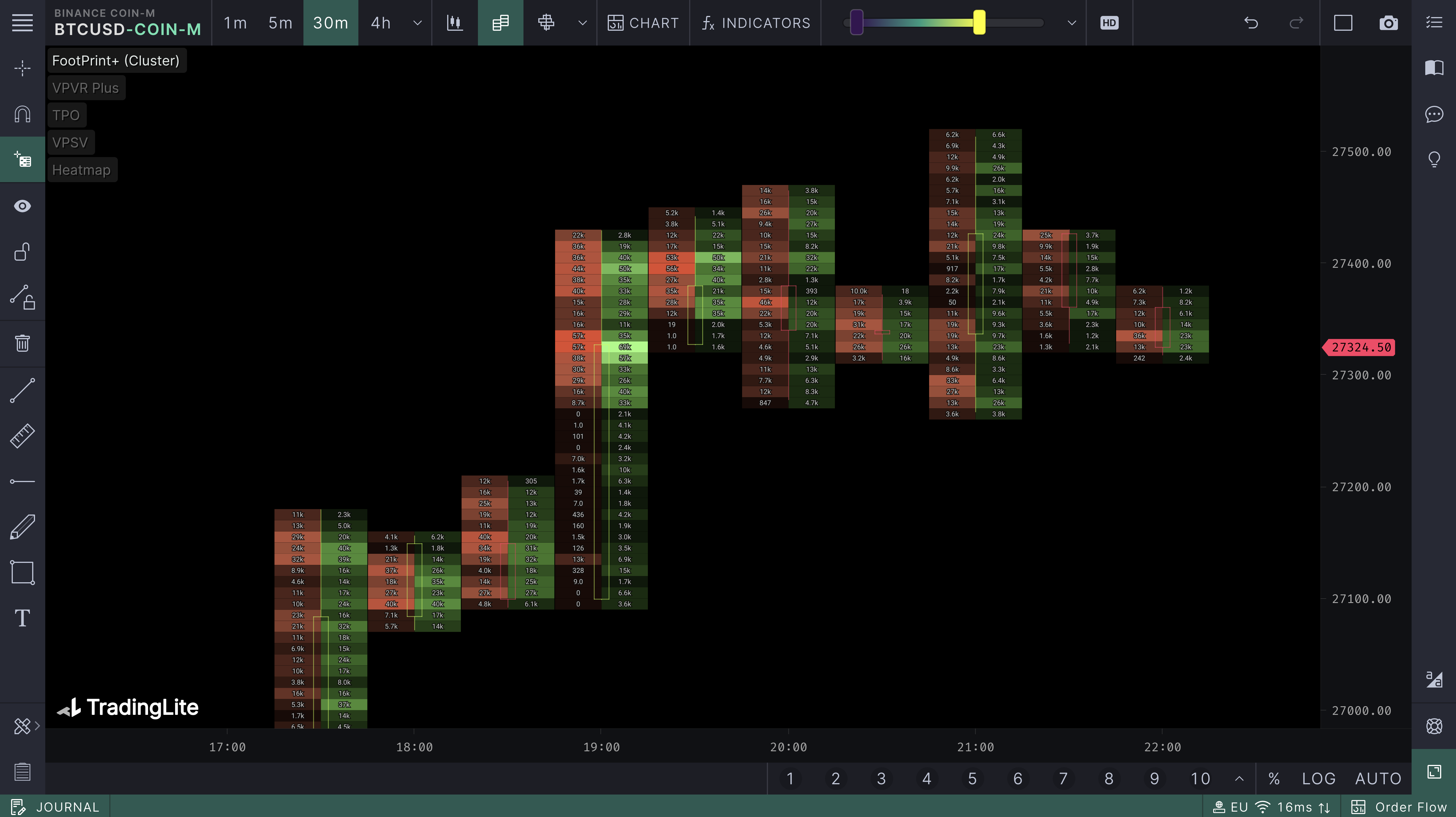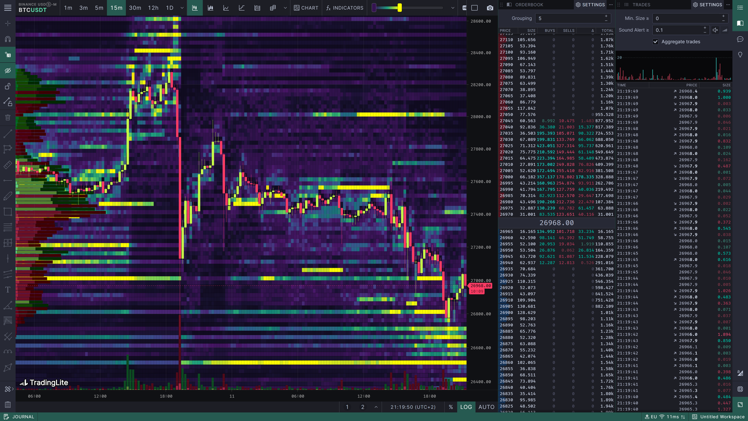
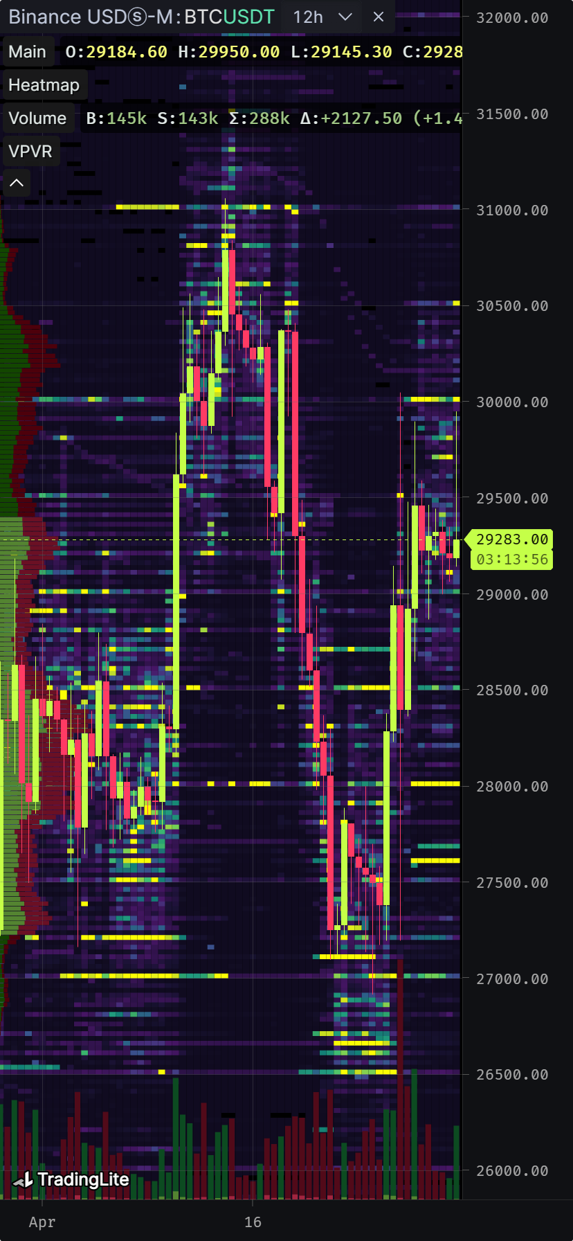
Liquidity & Order Flow technical analysis platform
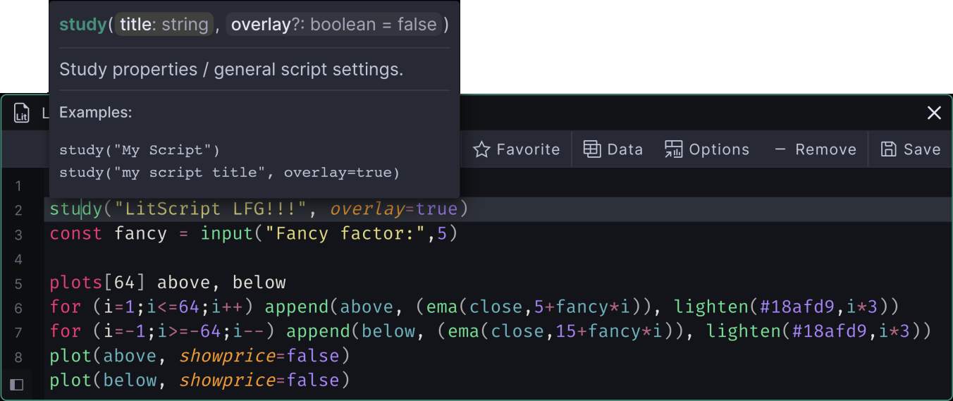
Define your edge in crypto via our real-time liquidity heatmaps, order flow suite & over 500 community created tools.
Try now - for free!
Define your edge in crypto via our real-time liquidity heatmaps, order flow suite & over 500 community created tools.